In this article we will get an understanding of two theorems of uttermost importance in statistics: the Law of Large Numbers and the Central Limit Theorem.
After a theoretical introduction, we will demonstrate the theorems performing computer simulations of a huge number of Bernoulli trials. We will repeat the experiments with different parameters and observe the outcomes.
All the work related to this homework can be found in the
repository, in the
homeworks/homework-04/ directory.
Theoretical background
The Law of Large Numbers and the Central Limit Theorem are crucial in statistics. Also, they are extremely useful in order to enter into the statistics’ perspective and to understand how probability works.
Law of Large Numbers
The Encyclopedia Britannica gives a strict and authoritative formulation of the Law of Large Numbers, along with a brief introduction:
law of large numbers, in statistics, the theorem that, as the number of identically distributed, randomly generated variables increases, their sample mean (average) approaches their theoretical mean.
Intuitively, this law states that even if there might be some contradictory outcomes when repeating trials for a small number of times, the more trials we do, the more the measured relative frequencies are close to the values of the theoretical distribution.
The Encyclopedia Britannica also gives a brief historical background about the Law of Large Numbers:
The law of large numbers was first proved by the Swiss mathematician Jakob Bernoulli in 1713. He and his contemporaries were developing a formal probability theory with a view toward analyzing games of chance. Bernoulli envisaged an endless sequence of repetitions of a game of pure chance with only two outcomes, a win or a loss. Labeling the probability of a win p, Bernoulli considered the fraction of times that such a game would be won in a large number of repetitions. It was commonly believed that this fraction should eventually be close to p.
We will talk about Jakob Bernoulli again, as we will use the random variable named after him to perform simulations.
Central Limit Theorem
As it is such an authoritative source, we will cite the Encyclopedia Britannica again in order to give a formulation of the Central Limit Theorem:
central limit theorem, in probability theory, a theorem that establishes the normal distribution as the distribution to which the mean (average) of almost any set of independent and randomly generated variables rapidly converges.
One important implication of the Central Limit Theorem is that it is often possible to replace a complex or unusual distribution with a normal random variable. This can be very useful, given the huge amount of theory formulated around the normal distribution.
Computer simulations
Below, we will proceed with the computer simulations. We will give some definitions to keep a consistent terminology:
- trial: a single experiment (e.g. a coin toss) with a known outcome
- path or trajectory: a set of trials performed in sequence
- relative frequency: an empirical frequency of trial outcomes computed on measured data
- distribution: theoretical probability of outcome of a trial
Methodology and resources
All the related work can be found in the homeworks/homework-03 directory of
the repository. As of the previous homework, the directory itself is structured
as an npm package containing a JavaScript library, bringing all the
advantages we already discussed.
A command-line toolkit is present in the repository. It can be used to perform simulations and generate relative charts offline and without a browser.
The chart.js library has been used to plot charts,
so the outcome of the simulations can be presented in a clear way.
The yargs library has been used to parse the
command-line arguments of the toolkit.
No third party libraries were used to actually perform the simulations.
Simulation software
First, the simulation library itself must be realized. In order to achieve a modular and flexible design, a number of JavaScript classes have been implemented:
| Class | Description |
|---|---|
| Simulator | Object performing the simulations |
| Simulation | Outcome of a simulation, along with its metadata |
| Plotter | Abstract configuration generator for chart.js |
| LinePlotter | configuration generator for a chart.js line chart |
| BarPlotter | configuration generator for a chart.js Barchart |
Simulator
The Simulator is used to setup and perform a simulation in a clean way. The
code is given below:
export class Simulator {
  constructor({ paths, trials, p = 0.5 }) {
    this.paths = paths
    this.trials = trials
    this.p = p
  }

  simulate() {
    const data = Array.from({ length: this.paths })
      .map(() => this.simulatePath(this.trials))
    return new Simulation({ data, p: this.p })
  }

  simulatePath() {
    return Array.from({ length: this.trials })
      .map(() => Math.random() < this.p ? 1 : -1)
  }
}
This approach encourages composition, eventually passing Simulator object to
functions that can then use them in a generic way.
Notice that the trials are performed with a Bernoulli distribution of
parametric probability p.
Simulation
A Simulation represent the actual outcome of a full simulation. It contains
the trajectory with all their trial outcomes and the metadata of the simulator
(e.g. the probability of the used Bernoulli distribution).
Also, there are handy instance methods to perform computations over the simulation data, such as relative frequencies and normalization.
Below, the full code is given:
export class Simulation {
  constructor({ data, p }) {
    this.data = data
    this.p = p
    this.paths = data.length
    this.trials = data[0]?.length || 0
  }

  relativeFrequency() {
    return this.data.map(path => {
      const a = Array.from(path)
      let sum = 0
      for (let i = 0; i < a.length; ++i) {
        sum += a[i]
        a[i] = sum / (i + 1)
      }
      return a
    })
  }

  cumulative() {
    return this.data.map(path => {
      const a = Array.from(path)
      let sum = 0
      for (let i = 0; i < a.length; ++i) {
        sum += a[i]
        a[i] = sum
      }
      return a
    })
  }

  gaussianFrequency() {
    const data = this.cumulative()
    const { mean, sigma } = this.getGaussianParameters()

    return data.map(path => path.map((x, i) => {
      const n = i + 1
      return (x - n * mean) / (sigma * Math.sqrt(n))
    }))
  }

  getGaussianParameters() {
    return {
      mean: 2 * this.p - 1,
      sigma: 2 * Math.sqrt(this.p * (1 - this.p))
    }
  }
}
The relativeFrequency method is used to incrementally compute the relative
frequencies of the simulation outcome for each trajectory.
Plotter and subclasses
The Plotter class offers a generic abstract interface to easily plot charts.
As you can see, under the hood, it uses the chart.js library:
export class Plotter {
  constructor({ data, xLabel, yLabel }) {
    this.data = data
    this.xLabel = xLabel
    this.yLabel = yLabel
  }

  static configureChartDefaults(Chart) {
    Chart.defaults.datasets.line.borderWidth = 1
    Chart.defaults.elements.point.radius = 0
    Chart.defaults.plugins.legend.display = false
  }

  plot() {
    throw new Error("Not implemented")
  }
}
This class also offers a convenient way to preconfigure chart.js.
For the purpose of this article, we will need to plot line and bar charts.
Each of those have its own class, defined as a subclass of Plotter:
export class LinePlotter extends Plotter {
  constructor({ min, max, ...args }) {
    super({ ...args })
    this.min = min
    this.max = max
  }

  plot() {
    const labels = Array.from({ length: this.data[0]?.length || 0 }, (_, i) => i)
    const labelStep = Math.ceil(this.data.length / 10)

    return {
      type: 'line',
      data: {
        labels,
        datasets: this.data.map(data => ({ data })),
      },
      options: {
        scales: {
          x: {
            title: { display: true, text: this.xLabel },
            ticks: {
              callback: (_, i) => (i % labelStep === 0 ? i.toString() : '')
            }
          },
          y: {
            title: { display: true, text: this.yLabel },
            min: this.min,
            max: this.max,
          },
        },
      },
      plugins: {
        decimation: { algorithm: 'lttb' },
      }
    }
  }
}

export class BarPlotter extends Plotter {
  constructor({ min, max, bars, step, ...args }) {
    super({ ...args })
    this.min = min
    this.max = max
    this.bars = bars
    this.step = step || Math.abs(max - min) / bars
  }

  plot() {
    const bars = this.#computeBarValues()
    const labels = Array.from({ length: bars.length },
      (_, i) => this.min + i * this.step)
      .map(x => x.toFixed(2))

    return {
      type: 'bar',
      data: {
        labels,
        datasets: [
          {
            data: bars,
            backgroundColor: 'rgb(75, 192, 192)',
          },
        ],
      },
      options: {
        scales: {
          x: { title: { display: true, text: this.xLabel } },
          y: { title: { display: true, text: this.yLabel } },
        },
      },
    }
  }

  #computeBarValues() {
    const bars = new Array(this.bars).fill(0)
    for (const path of this.data) {
      for (const z of path) {
        if (z < this.min || z > this.max)
          continue
        const i = Math.floor((z - this.min) / this.step)
        bars[i]++
      }
    }
    for (let i = 0; i < bars.length; ++i)
      bars[i] /= this.data.length * this.data[0]?.length
    return bars
  }
}
Notice that those subclasses can be called in a generic way, encouraging the use of composition:
function plotSomething(plotter, ...otherArgs) {
  // Do some stuff
  plotter.plot() // Who knows which concrete plotter am I using?
}

plotSomething(new LinePlotter({
  data: simulation.relativeFrequency(),
  xLabel: 'Trial',
  yLabel: 'Frequency',
  min: -0.2,
  max: 0.2,
}), './charts/relative-frequency.png')

plotSomething(new BarPlotter({
  data: gaussianFrequency,
  xLabel: 'Trial',
  yLabel: 'Zₙ',
  min: -3,
  max: 3,
  bars: 150,
}), './charts/gaussian-bell.png')
Running the simulations
The simulations can be ran locally without a browser using the dedicated command-line tool. It is written in the spirit of a UNIX tool:
$ yarn toolkit --help
hw04-toolkit plot [--paths n] [--trials n] [--height h] [--width w] <output-dir>

Commands:
  hw04-toolkit plot <outdir>  Plot the charts of a simulation to outdir/ (must
                              exist)

Options:
  --version  Show version number                                       [boolean]
  --help     Show help                                                 [boolean]
Launching the toolkit
First, install the dependency with yarn (or a package manager of your
choice):
yarn install
Then, create a directory for the charts images and launch the homework toolkit:
mkdir charts
yarn toolkit --paths 20 --trials 40000 --height 720 --width 1240 charts/
If the command executes correctly, the charts will be found in the specified directory as PNG images.
Source code
Below, the full source code of the toolkit is given, as an example of how the classes can be used:
#!/usr/bin/env node
import yargs from 'yargs';
import { hideBin } from 'yargs/helpers';
import { writeFile } from 'node:fs/promises'
import { ChartJSNodeCanvas } from 'chartjs-node-canvas';
import { Simulator, Plotter, LinePlotter, BarPlotter } from '../src/index.js'


yargs()
  .scriptName("hw04-toolkit")
  .usage('$0 plot [--paths n] [--trials n] [--height h] [--width w] <output-dir>')
  .command('plot <outdir>', 'Plot the charts of a simulation to outdir/ (must exist)',
    y => y
      .option('width', { type: 'number', describe: 'Image width (pixels)', default: 1240 })
      .option('height', { type: 'number', describe: 'Image height (pixels)', default: 720 })
      .option('paths', { type: 'number', describe: 'Number of paths (i.e. trajectories)', default: 20 })
      .option('trials', { type: 'number', describe: 'Number of trials per path', default: 40000 })
      .option('p', { type: 'number', describe: 'Probability of success for each trial', default: 0.5 })
      .positional('outdir', { type: 'string', demandOption: true, describe: 'Output directory' }),
    plot,
  )
  .help()
  .strict()
  .parse(hideBin(process.argv))

function chartCallback(ChartJS) {
  ChartJS.defaults.responsive = true
  ChartJS.defaults.maintainAspectRatio = false
  Plotter.configureChartDefaults(ChartJS)
}

async function plot(args) {
  const simulation = new Simulator({
    paths: args.paths,
    trials: args.trials,
    p: args.p,
  }).simulate()

  exportSimulation(new LinePlotter({
    data: simulation.relativeFrequency(),
    xLabel: 'Trial',
    yLabel: 'Frequency',
    min: -0.2,
    max: 0.2,
  }), args.width, args.height, `${args.outdir}/relative-frequency.png`)

  const gaussianFrequency = simulation.gaussianFrequency()

  exportSimulation(new LinePlotter({
    data: gaussianFrequency,
    xLabel: 'Trial',
    yLabel: 'Zₙ',
  }), args.width, args.height, `${args.outdir}/gaussian-frequency.png`)

  exportSimulation(new BarPlotter({
    data: gaussianFrequency,
    xLabel: 'Trial',
    yLabel: 'Zₙ',
    min: -3,
    max: 3,
    bars: 150,
  }), args.width, args.height, `${args.outdir}/gaussian-bars.png`)
}

async function exportSimulation(plotter, width, height, outfile) {
  const configuration = plotter.plot()

  const chartJSNodeCanvas = new ChartJSNodeCanvas({ width, height, chartCallback })
  const buffer = await chartJSNodeCanvas.renderToBuffer(configuration)
  await writeFile(outfile, buffer, 'base64')
}
Simulation analysis
A simulation basically consists in a set of outcomes of Bernoulli trials, grouped together in trajectories. Below we will discuss the Law of Large Numbers and the Central Limit Theorem, giving the outcomes of some simulation in support of our theses.
Relative frequencies
Let $n$ be the number of trials. The Law of Large Numbers states that with $n \to \infty$ the relative frequency tends to the theoretical mean of the reference distribution (a Bernoulli in our case).
First: let’s perform a simulation with a small number of trials per path:
yarn toolkit plot --paths 10 --trials 80 -p 0.5 charts/trials-small
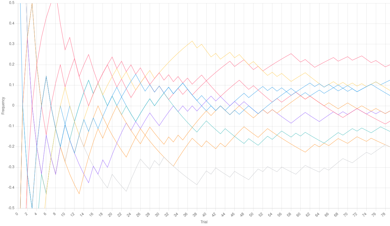 Relative frequencies with a low number of trials
As we can see, the relative frequencies in the chart above even go out of the bound we chose, and definitely do not seem to tend to the average mean (which should be 0 for a Bernoulli distribution with $p = 0.5$). However, let’s drastically increase the number of trials per path:
yarn toolkit plot --paths 10 --trials 20000 -p 0.5 charts/trials-high
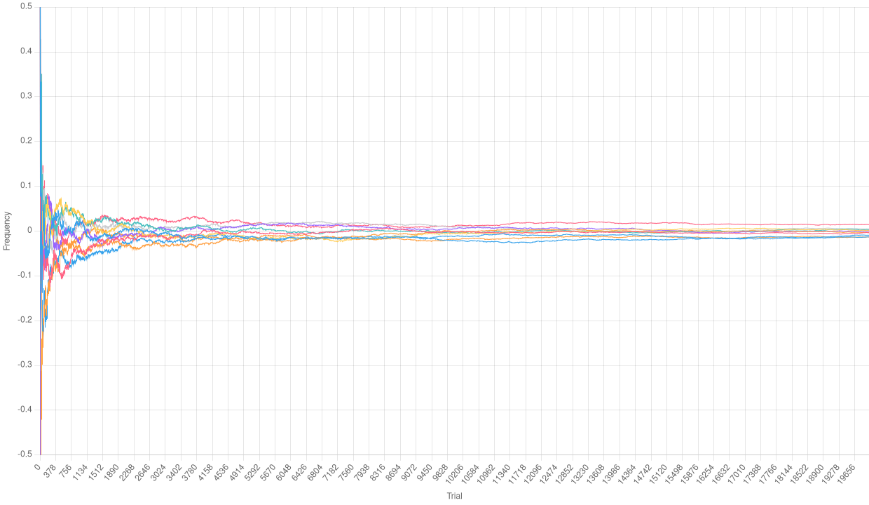 Relative frequencies with a high number of trials
We can definitely observe that the Law of Large Numbers is working here. It is clear that, after some initial fluctuations, the relative frequencies of each path tend to 0.
Normalizing the relative frequencies
With the Simulation.cumulative instance method, we can compute an empirical
Binomial distribution over our simulation. Doing so, we can scale and center it
to obtain a Gaussian distribution. Let’s examine the
 Normalized empirical Binomial with a low number of trials
 Normalized empirical Binomial with a high number of trials
As a surprising result, we observe that the charts are quite similar. The number of trials is too small to see the effects of the Law of Large Numbers. However, if the empirical distribution is normalized, it tends to assume the shape of a Gaussian one. We will see this much better in the following section.
Observing a Gaussian bell
Perhaps the most iconic shape in all statistics is the so-called Gaussian bell. In a Gaussian distribution, the probability tends to aggregate around the mean, with some values at the edges as “exceptions”. We can group the results of the previous normalization of the empirical Binomial distribution and plot a bar chart to see if its shape resembles a Gaussian bell.
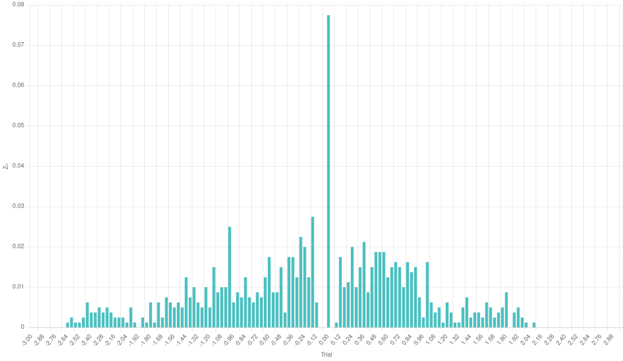 Bar chart of the normalized empirical Binomial with a low number of trials
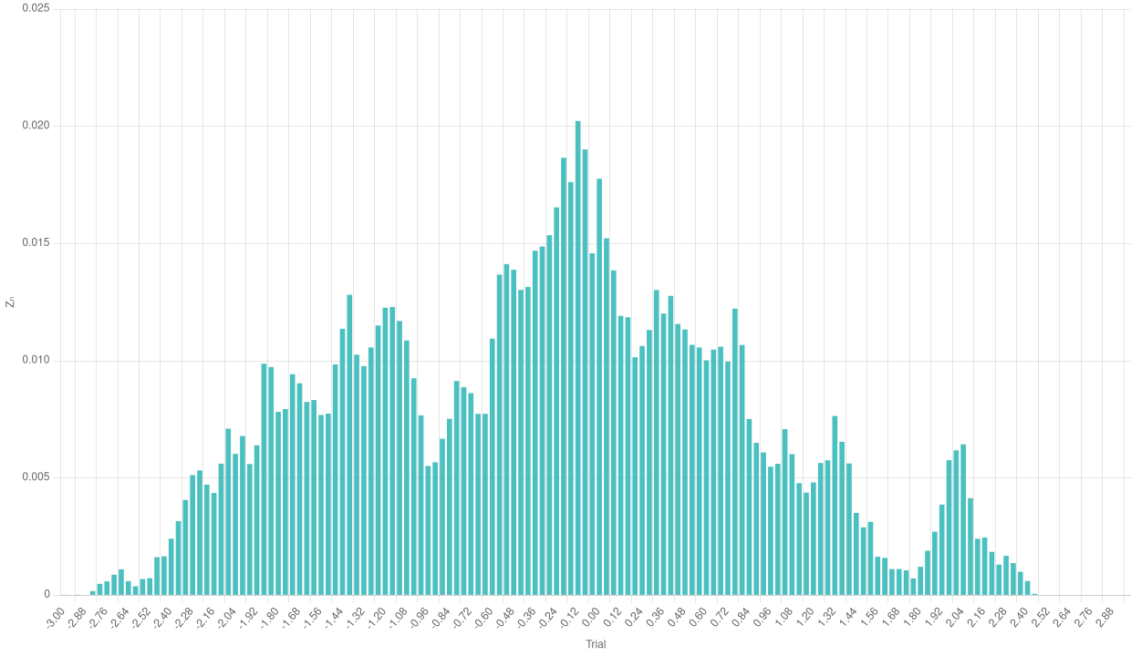 Bar chart of the normalized empirical Binomial with a high number of trials
We can see a rather odd shape in the case with a few trials. The number of single experiments is too low to make the frequencies aggregate around the theoretical mean. The case with a higher number of trials is much more significative and makes us see the effects of the Central Limit Theorem.
A huge number of trials
Below, we give the three charts types we included before, this time for a very large number of trials (took 42 seconds and about 3Gb of memory to generate, and managed to crashed my computer a couple of times trying with higher numbers):
yarn toolkit plot --paths 30 --trials 300000 -p 0.5 charts/trials-huge
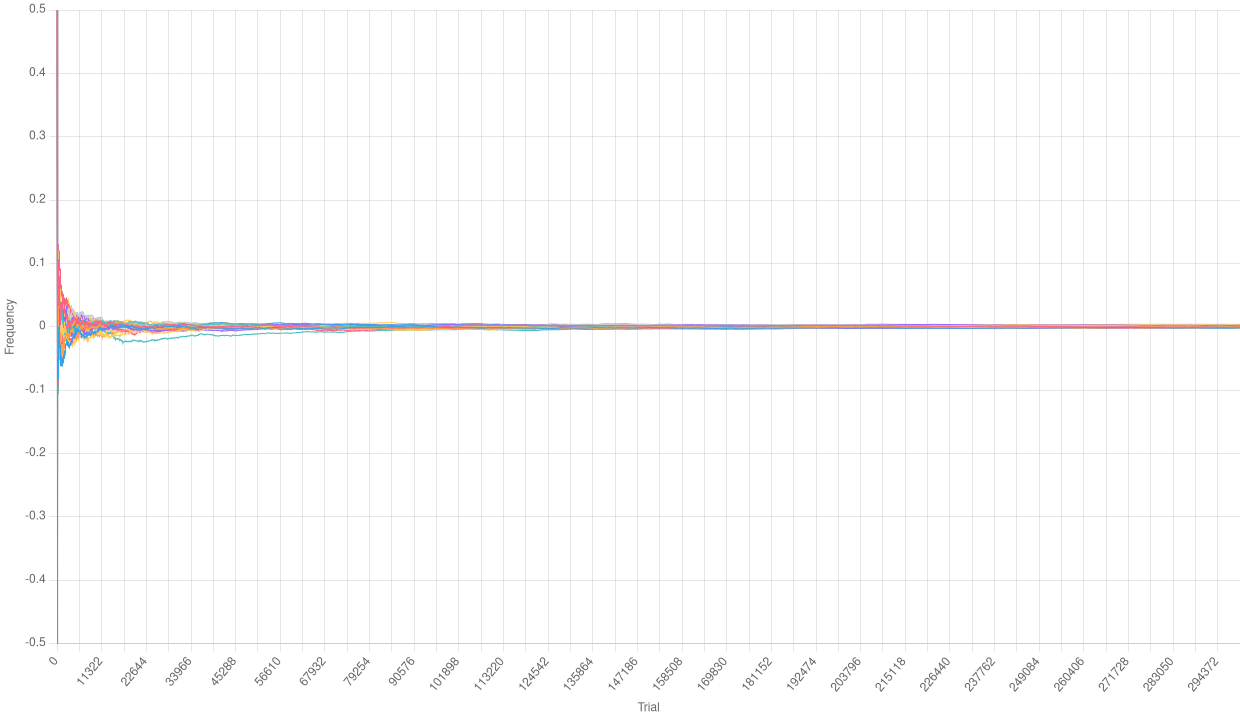 Relative frequencies with a huge number of trials
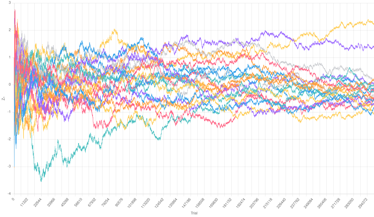 Normalized empirical Binomial with a huge number of trials
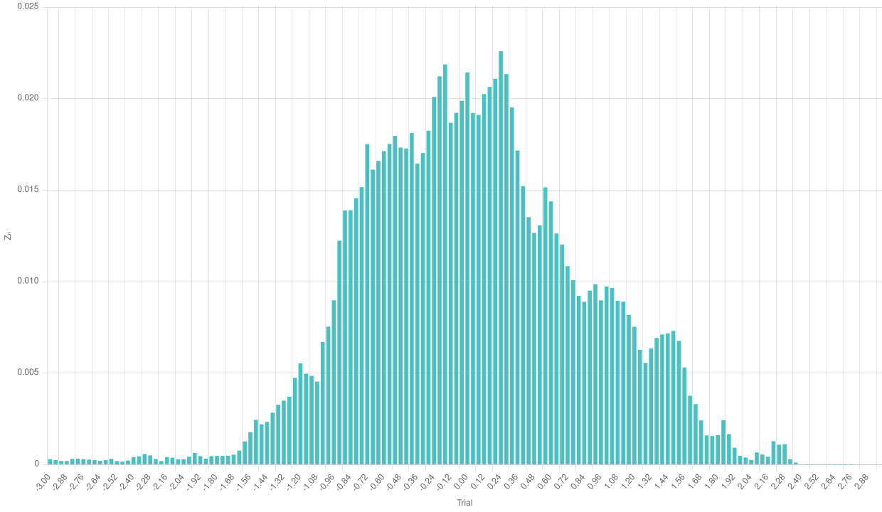 Bar chart of the normalized empirical Binomial with a huge number of trials
Especially with a higher number of trajectories, we can really appreciate the effects of the Central Limit Theorem in the bar chart.
Conclusions
We developed a small framework to perform computer simulation of a large number of Bernoulli trials.
Then, we managed to leverage such simulations to understand the effects of the Law of Large Numbers and the Central Limit Theorem.